|
Here it is a quick view of some of the other works in the studioa And, finnaly, the work I choose to exhibit. 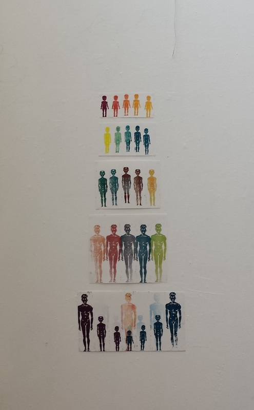
0 Comments
The first thing I did today was checking my prints in the printmaking workshop. Everything looked fine. I took a Monoprint done yesterday to use as a background for that Bluebeard illustration. By accident, while cleaning up, I managed to obtain the same strange purple I used in my paintings. I was eager to actually paint on top of that print. Everything appeared to come into the right place. Once I got to the studio, I discovered to my greatest despair that there wasn’t any more paint. No more red. No more violet, Nothing I used a matching colour pallet for the whole project and now I had no more colours to mix. In the end I managed to find some white, some maroon and some red oil paint(yes, oil) and made a fast painting. I illustrated the secret chamber of the corpses using stylised skeletons. I must confess I was partly inspired to do so by Tin Burton’s Corpse Bride(one of my favourite animations, to be honest). The painting was not what I planned, but taking into account the circumstances, the outcome was acceptable. 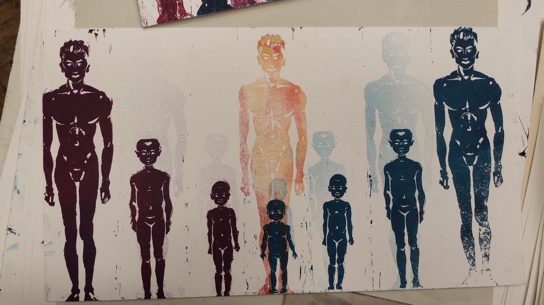 While painting I found out that we have to choose just one piece of work to present for evaluation. That broke my heart. Obviously, next thing I did was to panick. I have never thought about selecting just one piece. Indeed, there were some stronger ones. But all of those pieces were part of a puzzle. Taken out of context, they lose most of their power. For a couple of moments I was bewildered. I started looking at my paintings and I tried to figure out which was the most consistent. It was impossible to actually choose one. Each of those was made in very different manners. They complemented each other, but I don’t feel that any of those could reveal me entirely. They represent different angles of my personality, but they are far from being representative on their own. Maybe as a series of paintings, yes, they could work, but taken separately not. I thought about maybe improving some of those works. But they all seemed finished. They are finished. While I was trying to figure out my next move I had some help from a second year student who asked to see may work. At that point I remembered about the prints. I got them from the workshop and showed them. She was immediately drowned by the small baby print I did as a sample. 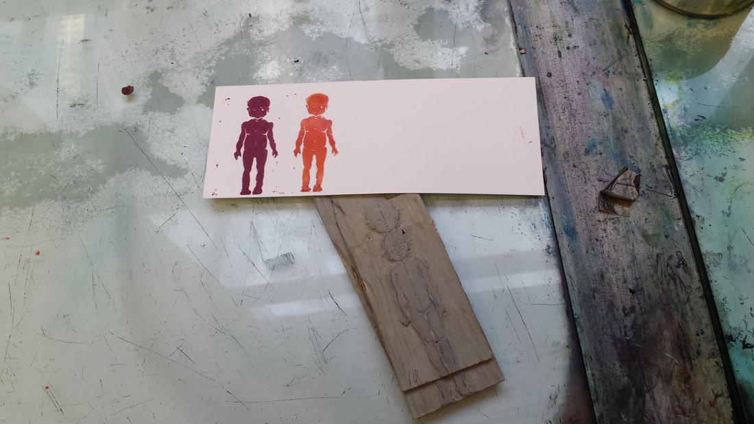 The truth is I found a piece of paper in the printmaking workshop. I don’t like wasting any material, so I used it to try some ink. That was it. Just an experiment. She said she feels that may be my strongest piece. I didn’t consider sharing my prints, to be honest. I only thought about my paintings. At that point, I haven’t thought about sharing those babies. Maybe the mirrored piece. But I was not sure about that either. 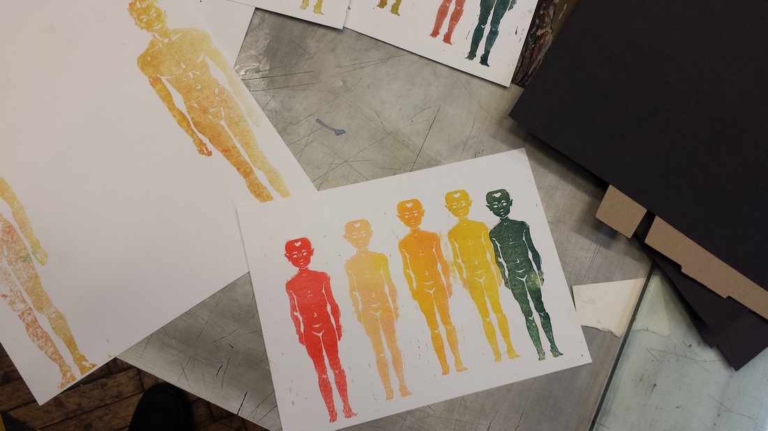 After a short chat whit the second year student, I run back to the printmaking workshop. I illustrated the journey of body and will throughout life. This piece comes as an explanation for the one I did yesterday. 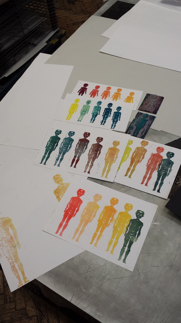 The body is showed at different stages. There is the illusion of uniqueness (which comes from the multitude of unique desires controlling our lives-illustrated throw different colours). All those bodies have the same aim, the same path, same fate. They are growing up… growing old. They are all slowly dying. In the end I feel that this is indeed the most consistent and representative work I have done. It also holds everything together. It works as an explanation for the whole theme I have chosen to illustrate stories in an attempt to run away from death. In an attempt to hold everything together The moment I let go those fairy tales-the metaphor of childhood-is the moment I accept my death. And I am not ready for that. I do not aspire to acquire the Genius status, but I would choose a life of asceticism in a world of fairy tales.
Today was a day spent exclusively in the Printmaking Workshop. I had to finish my linocuts and to finnaly play with the press. Although I planned to make more human figures, in the end I decided to save some time for another project and see what happens if I the use the only 4 figures. 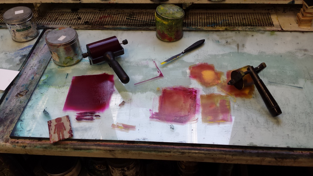  After finishing my last figure-the adult-which, by the way, was a disapointment(it looks more like a Ken than like a human being, the head is disproportional, the cheekbones are too high, the hair looks too Edward Cullen-yeah! It's not right, I know! That is one of the disadvantages of linocut. There are some mistakes that cannot be repaired. In fact, it all started with a drawing mistake. Before actually drawing the face, I draw a skull, just to approximate the height of the head. Unfortunately I made the mistake of erasing the first drawing and then draw the face on top of that. I was mislead by the penciltraces. The eraser was not working on the lino, so I had quite a confused drawing. I was also eager to start printing so I also rushed a bit. At least I have learnt something from this experience), I went on to discover the magic of INK!  Before actually printing an illustration of the theme- a human's journey throw life- I pinted some saples of mixed ink. Looking for some blue, I accidentally came across a wonderful carmine (I imediately remembered a fairytale I could use for a new painting! https://en.wikipedia.org/wiki/Bluebeard! So I decided to save some ink for later.)I needed to use it. It was just so seductive. I could not resist it. In fact, I wanted to play arowng different shades of blue/green/ultramarine/dark. But that plan was abandoned after this dicovery  The baby was printed overlyering yellow ink over the pure carmine. I loved how the coulour was living within a static figure. Those prints revealed the splendor of colour in the most unexpected way. It was the violent contrast between the imobility of the contour and the dynamicicty of colour that made it possible. I enjoyed creating a sence of movement, of ciclicity, simply by adding colour and not cleaning the lino afer each print. 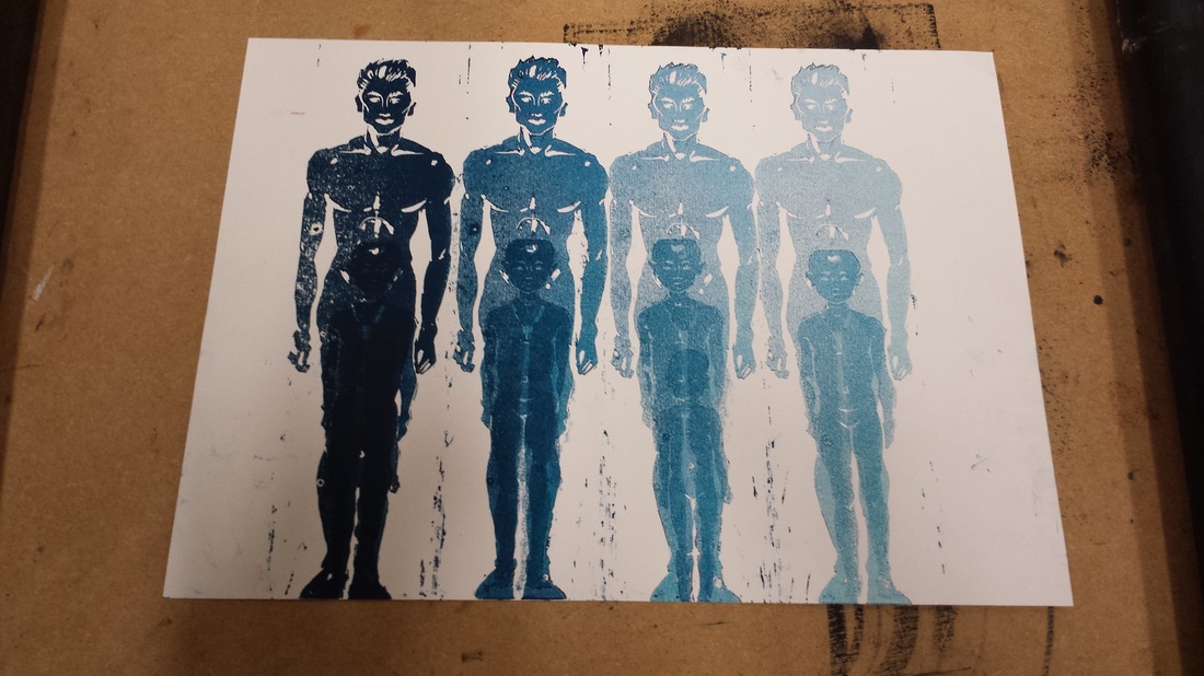 Then I found myself in a huge dificulty. I had 4 figures. I understood that my initial plan was not going to work-I imagined a white paper with a frame made by those figures. I could not find a paper big enough-the adult figure was already 24cm. I had to illustrate the ciclicity of life, the evolution of the body in a different manner. maybe...Erasing may be the answer for my problem. And it actually was. I wanted to emphasise the perenity of mankind, the slowly death we are all doomed to, oneness of fate, the equality of the mankind in front of death. For this particular print I was strongly influenced by the german philosophers, Immanuel Kant and Arthur Schopenhauer. (Unfortunately, I realise the adult figure does not faithfully illustrate the sobriety of this theme, as it has a superficial aura. It s almost painful for me to look at it. Especially as I also have in mind the imge of how it should have looked.) 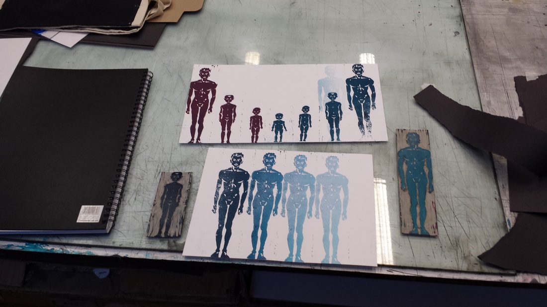 However, the image above- the mirrored one, illustrates Schpenhauer's theory, the Will is a malignant existance controling the actions of individuals (it is an Evil to be terminated by mankind's duties: asceticism and chastity, which I did not illustrate here. However, I think I may try to make a series of prints trying to capture as mush as possible from those phylosoplies.) I illustrated the Will as the desire to grow older. A desire that leads nowhere. As vague as each human desire, and just as absourd...and ironic. The one underneath illustrates the identity of fate. The slowly death of individuals. Both phylosophers agree about this theory, agout the nothigness of common peopl's wills and desires...about their lack of path, about the OMNIPOTENCE of Death.( They say that there are some more or less "escape hatchs". Only the Genius can escape the ocean of nothigness of life. The Genius is that human being who deliberately chooses ascetisism and isolation. He asscedes to higher universes of understanding by meditation. He is doomed to constant suffering. His existance is beyond human understanding). 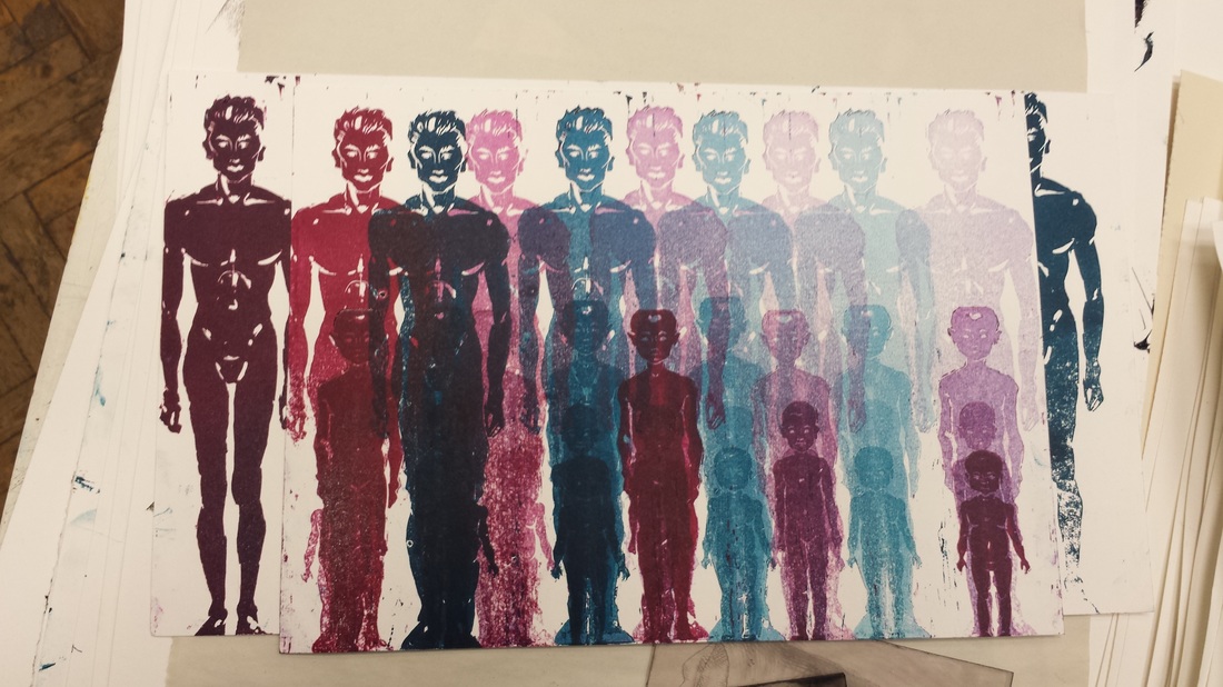 In the end I tryed to illustrate the idea of the discrepancy and the inadaptability of Genius by printing an adult figure over the baby one in the mirrored image. Unlike most individuals, the Genius acknowledges his smallness. His aspirations surpass everyone's else. He is able to rise to a world of understanding and almost try to defeat death.  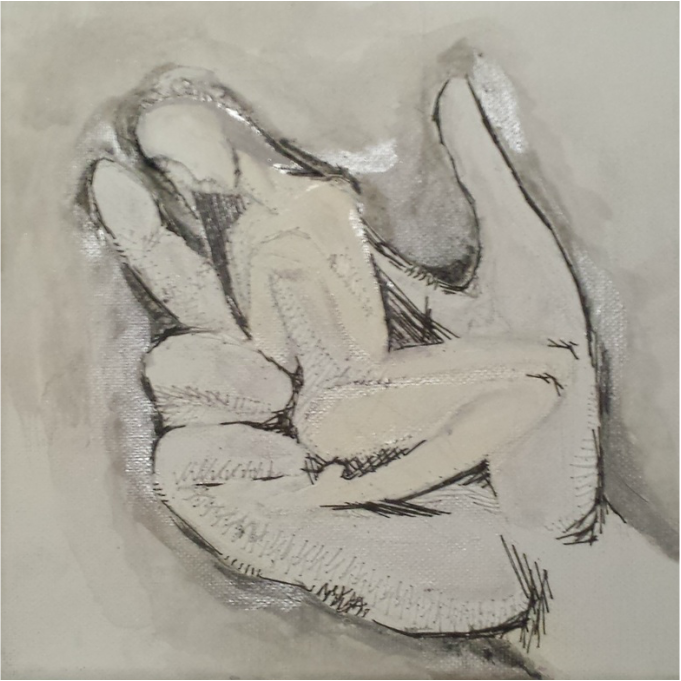 After virtally visiting Michael Raedecker's exhibitions and analysing his details, I thought that I may just give sewing a try. I am not a "landlady", I am a pioneer in this craft. Or may I call it Art? Firstly, I don't actually know how to properly sew. I don't even know if there is a certain"proper" manner of sewing. But if it is, I surely missed it. The back of my canvas is more chaotic and tangled than the whole human history. Reading about Raedecker's work I found out that his marks appear to be randomnly spread across the surface. He doesn't actually embroiders. Not in the classical manner. This gave me courage Secondly, one thing was clear, if I was going to sew there was no better story to be illustrated than Thumbelina. I found this thought unusually funny. I was eager to start working. I enjoyed the iroy behind focusing on the hand. The whole fairytale is build in a microcosmos-a hand tall microcosmos. Sometimes- too often, an artist's universe is just as tiny. But there may be Beauty. There may be Genius. There may lay the essance of that artist's life. So I narrowed my sourface and I tryed to remain as faithful as possible to the human's hand proportions. I challanged myself AGAIN not to use colours. And to a certain degree I succeded. As I was working with thrad on canvas I remembered I had some textile paint. It seemed absolutely compulsory to use some in this piece. For a long time I was in doubt. Should I leave the pencil marks visible? Should I erase them? COULD I erase them? The solution was a compromise. I left the contour slightly visible, by covering it with a thin layer of white paint. Here and there I needed some shadows. I juggled with colours and thread. In the end I added some silver textile paint which makes the painting a little bit more courious. It does not remaind completely still, it changes depending on the laightening and on the angle you look at it. Just like the golden spell inspired by Rumplestillskin.  Elizabeth Peyton is one of the artist names that my tutor recommended to analyse at a deeper level. She is an American artist who is mostly interested in portraiture. She admitted the importance of photography as an inspiration source for her art. She usually works from photographs. She paints in both watercolour and oil. She is best known for the ambiguous figures she portraits. Her work is extraordinary delicate, vague. Her portraits have a melancholic aura. They seem captured in a world of their own. https://www.pinterest.com/search/pins/s=ac&len=2&q=elizabeth+peyton&term_meta%5B%5D=elizabeth%7Cautocomplete%7C0&term_meta%5B%5D=peyton%7Cautocomplete%7C0 I looked closer at the economy of brush strokes and also at the relatively limited colour palette. was planning for a long time to paint monochromatically. But I didn't know what to expect. I am always craving for more colours, more tones, more nuances. I felt that the more complex the palette, the more expressive the painting. However, looking at Peyton's monochromatic works, I understood that the expresivity doesn't lay exclusively in the colour choice. It was a formidable discovery. A painting can be extraordinarily powerful and expressive, even violent, with a limited palette. It can be even more dramatic. In my work, in my paintings actually, I have always felt that the most important element was the colour. In my mind, at every sight, I transform and build new colours, new harmonies, inspired from a certain colour detail. I am always striking to materialize on the canvas the colours hunting me. I was terrified of losing my freedom in choosing colour and my relation to the painting. I felt that without colours I am left completely inarticulate..  To my surprise, this didn't happen. Without focusing on the colour, I was able to concentrate on the figure. What usually happenes when I paint, I build the image by applying colours, playing with light and shadow, with worm or cold tones. Now it was all about the lines. I applied the colour(Acrylic) using a watercolour brush- a very delicate one. I knew, from the Pre-Rafaelite Painters, that I could acquire a wide range of details with this trick. I wanted to try something new, and so I did. 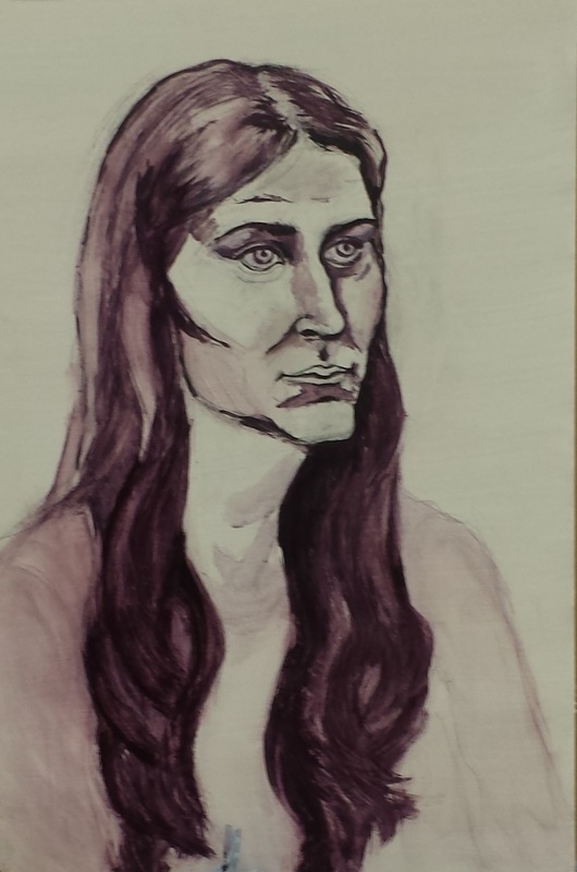 By the time I choose the brush I was not sure how detailed I want the painting to be. However, when I actually started painting, I was drawn to playing with the planes revealed by light and shadow, forgetting about the details. I applied colour on the board almost as if I was using an oil brush(it came naturally). Sometimes, as I remembered the initial purpose-I tried to go back to the watercolour manner of applying colour, but every time I failed. It is not because of habit. It is because the image(that was supposed to develop the idea of Fluidity and Transparency) was dominating. I wanted to create a dim image, a vague portrait. The painting was more powerful, it cried for deep, violent lines. I let myself led by the painting. 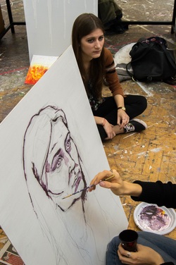 Unlike Elizabeth Peyton, I did have a life model posing for me. Here I broke a rule. The model was posing way closer to me then it is advised. So far I cannot actually see if I have mistaken the proportions or not. It takes me some time to be able to objectively analyse my work. 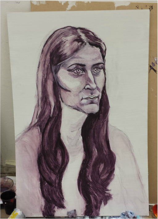  Dexter Dalwood-"Sunny Von Bulow" 2003 Oil on Canvas 150 x 207cm “The Steadfast Tin Soldier” https://www.youtube.com/watch?v=PSBM3NqgWSE http://www.saatchigallery.com/artists/dexter_dalwood.htm http://www.gagosian.com/artists/dexter-dalwood/artist-exhibitions https://www.youtube.com/watch?v=lV7SF-038IE http://www.timeout.com/london/art/dexter-dalwood-interview-everything-should-be-up-for-grabs Whenever we are (re)creating an imagined/story space, we are playing around with our memories. We can only operate with what we have. There is no other way to see something we could not perceive than by transforming our knowledge. The created image may be more or less lifelike depending on our background, our knowledge, our perspective of life, our level of creativity etc Whenever we are told stories, our imagined world merges our reality. Places we saw are transformed into magical universes, sometimes they are unrecognisable, yet they are so familiar! This is the marvelled of the Fairytale. They belong to us! They are ours! They have been ours from the very first time we heard them and we imagined them. The more we see the more we can imagine, the more beautiful and the more complex the fairytale! As long as we are still willing to get lost in those so called childish worlds. Fairytale are living works of imagination, works of art. We create and we recreate, we discover and we rediscover a world of imagination each time we hear/read/remember a fairytale. It is not child's play! Not at all. Especially when, as an art student, you are surrounded by so many images! A collage a la Dexter Dalwood only comes naturally! The complicated task is to actually choose from those images the one that fits best Your story, and then, to transform it, so that it comes to life the way You want it to. When, as a child, I was read “The Steadfast Tin Soldier”, the most powerful image was the tragic yet deeply romantic ending of the story. I used to compose that image using illustrations from books, drawings I saw, dolls and toys I had and my grandparent's old stove. I have always been fascinated by the cheerful dance of the flames. I watched breathlessly how those wonderful worm (almost) living creatures devoured the wood. I have never really felt sorry for the toy couple. It was something sublime in their disposition in the whirlpool of flames. As I grow older, the image slightly changed. I still carry the childhood representation, but now I am able to make the imagined world a little bit more... complex! I would now create an image joining together Degas's ballerina and Reynolds's soldier(slightly mutilated) on a John Martin Apocalyptic background. The Magnetic Surface would then reflect my new imaginary interpretation of this particular scene. 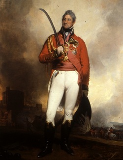 Sir Martin Archer Shee-"General Thomas Picton" Oil on Canvas 1809-10
 John Martin "The Great Day of His Wrath" 1853 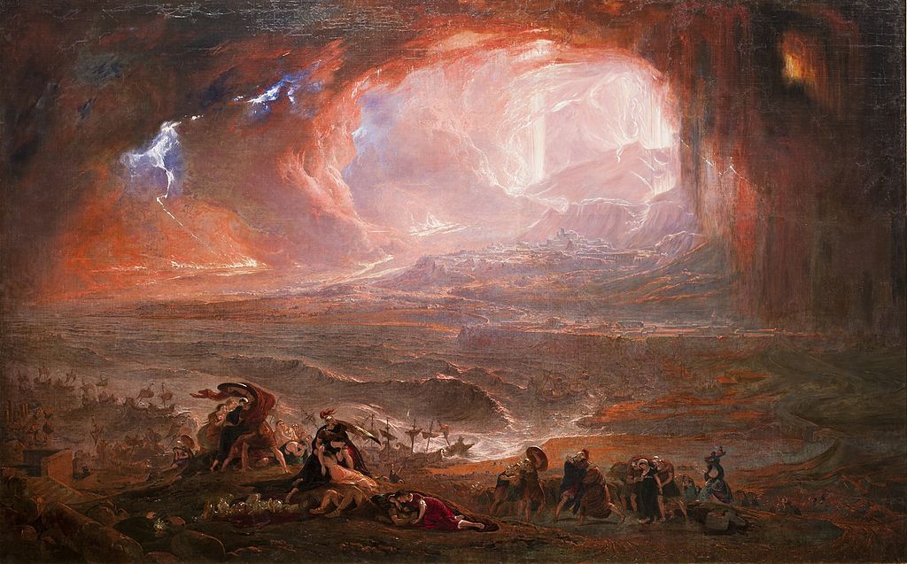 John Martin "The Destruction of Pompeii and Herculaneum" Oil on Canvas 1822 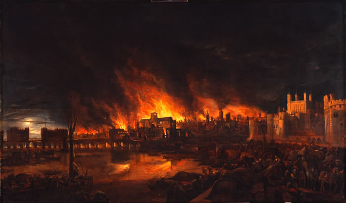 Lieve Verschuier-"Painting of the Great Fire" Oil on Canvas 1666  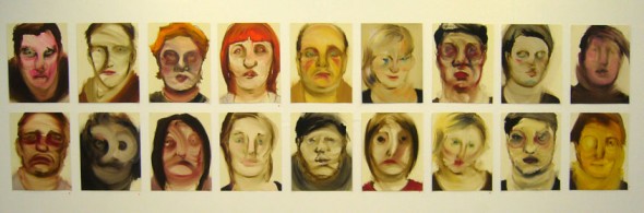 Imaginary Portrait Series, 2006, oil on paper, 18 pieces (50 x 40 cm each). Courtesy of Yuko Nasu http://yukonasu.com/ http://yukonasu.com/frameset.html From the beginning of the history of painting the face played a privileged role in image making It took generations and generations of artists to master the task of representing a facial expression. It took other ages to create an ideal of beauty, and then other generations to destroy that definition and build another one on those ruins. Every time the essence of beauty laid in unity and in symmetry. In the living image. It is wonderful how expressive Yoko Nasu’s dying images are! The deconstructed face cries for a new definition of beauty, questioning the notion of Beauty in itself. The contortions of the vanishing figures tell a story that call in question the toil of everyday life. The image is no one. But it can be everyone. In here lays the frightening charm of those paintings. The artist masters the art of de-constructing a figure, of making it fade away in a tacit, painful way. There is a bizarre delicacy in the circular motions that languish the figure . The mastery of illustrating a vanishing figure is to be seen in Michelangelo's "The Dying Slave". Unlike in Yoko Nasu's work, the materiality of the marble seems to perish with the fading body. Somehow Yoko Nasu s work brought before my eyes that statue. There is something breathtaling in the dynamism of death, that has bees captured in those works of art. 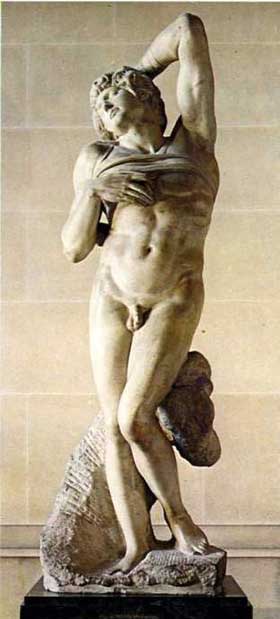 Michelangelo-"The Dying Slave" 1513 I have tryed to borrow some of those movements and some of the immateriality of those images to ilustrate a critical moment in our lives. The slowly death of the faith in fairytales. There is a certain point in everyone’s life when noting in certain anymore, when even the eyes are in doubt, when no one is to be trusted. The life is no longer a firm line between GOOD and BAD. It’s the beginning of our maturing. This is when our inner child is the mostly endangered. It is the first time when Fairytales are questioned What if there is no Nederland? What if there are no fairies? What if the hero could die? Why don’t they ever die? What if they are not living? What if they don’t exist? What if there is no real hero? Every child dreams of growing up to become his fairy-tale favourite character. It would be absolutely revolting not to accept that the core of our adult aspiring figure was not influenced by those childhood stories. However, before realising this, inevitably, the growing child denies his old escaping world. Because in life there is always a new battle Because in life there are seldom magical aiders Because in life there is no clear line between good and bad Because growing up is painful Because the good doesn’t always win Because there is death Because sometimes there is no faith Because no armour can protect you from the nothingness of life Because it takes years after years to finally find a path Because there is no certainty that there is a path-THE PATH Because you may not be the hero… Because you may be the despised character… in your own life Because your inner child is slowly dying and with him- the remains of your Hero I wanted to explore the Translucidity of Erasure. But The surface needed a dramatic, strong Background. It was violent and painful. Therefore I erased everything into sable- which here became the essance of the air. Finnaly I illustrate the void-the dying hero- by the lack of the eyes(so called the mirror of the soul). I think there is nothing more powerful nor more painful than the denial of the soul..In my attempt to illustrate the uselessness of corporeality lacking a spiritual existance I used the tehnque of overlyering-the so called magnetic surface-creating the hauberk. Then I left everything be swallowed by the abyss. 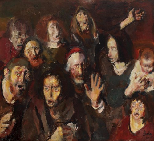 Corneliu Baba- The Fear 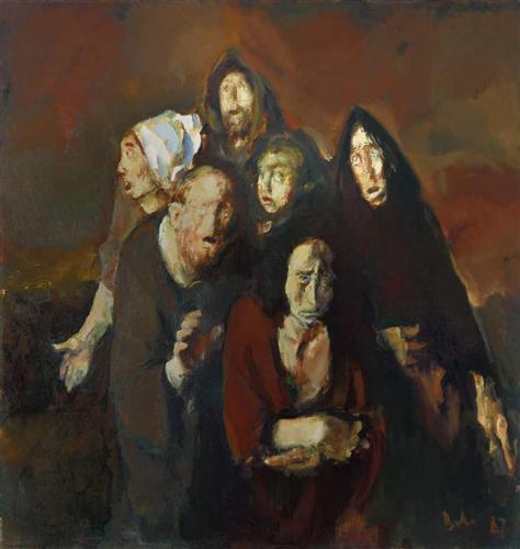 Corneliu Baba- The Fear 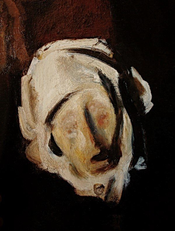 Corneliu Baba- Detail 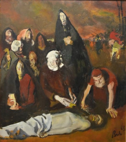 Corneliu Baba-Pieta However, I haven't found any painting that may reach the maiestry of depicting the excruciating movement of the dying soul as lively as Baba's masterpices
As I said I am going to picture the evolution of human body throughout life, I think printmaking offers more possibilities to explore this theme. I researched different anatomical drawings from Paul Richer’ s "Anatomie Artistique”, William Rimmer’s “Art Anatomy”, Andrew Loomis’s “Figure Drawing”, Robert’s and
Tomilingson’s “The Fabric of Human Body ”. I also used the Internet’s resources. I was mainly interested in the changes in proportion (although I couldn’t help making some movement studies) Once I got to the workshop I spent most of my day measuring, drawing, measuring again and, eventually, lino cutting. So far I managed to make 3 figures, illustrating 3 different ages. 3 more to go. The fun has just begun, as The real creative part is actually printing, layering, fading, erasing. Do you remember closing your eyes as you were told stories and following the characters in their world of wonder? Do you remember the magic fog that surrounded those heroes? Haven’t you picture the dance of a magic spell? A frightening, hypnotising, breathtaking, never ending movement? I wanted to illustrate that memory. I have never been a huge fan of yellow. I always considered it too light and too impure. Somewhere at the edge, a very vivid colour, a very unstable one. I didn’t like it on my palette I avoided it. I only used it combined, in order to obtain a lighter tone. Today I felt like making a tribute to my least favourite colour. I used acrylic paint diluted in a very shiny medium. With a huge brush (the same used for priming) I applied fluid strokes of paint, trying to make the traces of the brush as visible as possible. Then I rotated the brush 360° and made big circles. I added more layers and more colour. As the painting progressed, I felt the need of more colour. The yellow looked diseased. Initially, I tried to paint monochromatically and then maybe incorporate the golden paper. I ended up with a frail image that was desperately crying for purple. It was immediately revived. It earned a whole new vigour, dynamicity. My inspiration was Rumpelstiltskin’s spell. 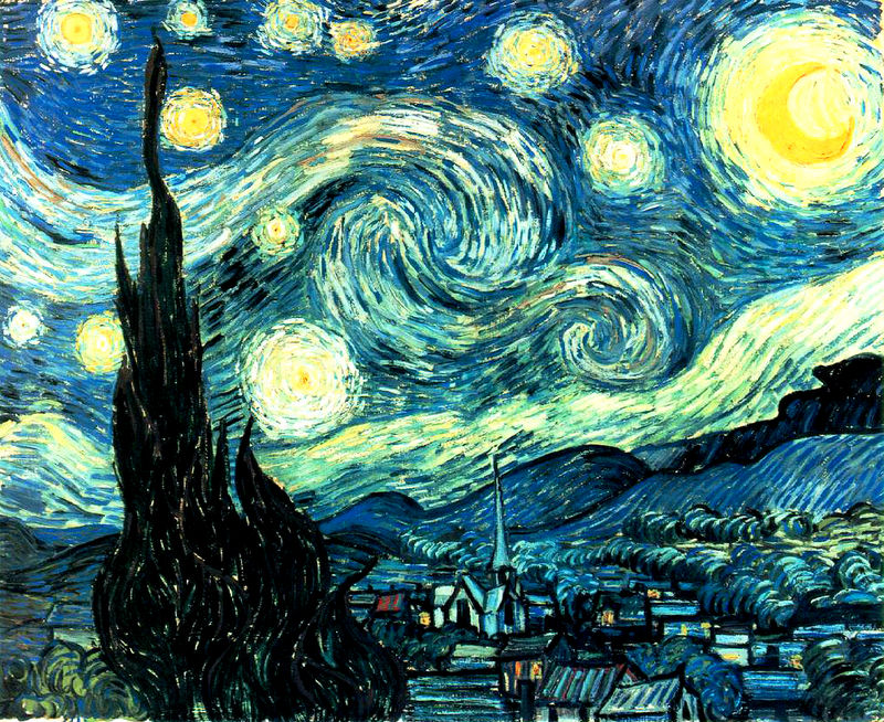 Van Gogh- "Starry Night" Oil on Canvas 1889  However, eventually, I discovered distant echoes of Van Gogh’s “Starry Night” in my piece of work. Unconscientiously I appropriated the movement of colour on the surface from the great master. http://www.nationalgallery.org.uk/artists/vincent-van-gogh http://www.artble.com/artists/vincent_van_gogh/paintings/starry_night/more_information/analysis Another unexpected echo I was pointed by Fran was Klimt's golden predilection. This was another unconscient link. 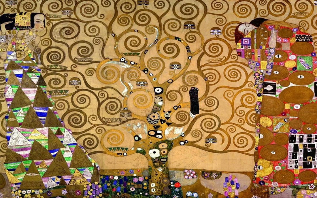 Gustav Klimt- The Tree of Life, 1905 Today’s discussion with Yvonne was wonderful. Not only I was highlighted other aspects of the module I didn’t consider, but also she explained what is the mastery of different artists cited in the presentation of the module. We were showed a quite large number of contemporary painters, with completely different methods of applying colour. I must confess it could have been quite hard (not impossible, but hard) to analyse and understand the strengths of each of them. Some artists are able to present an image keeping their methods quite subtle. For example Elizabeth Peyton succeeds in creating wonderful living figures with an economy of colour stains. The paintings are delicate, natural, vivid, but only as an (aspiring) artist you may be able to seize the artistry of possessing a figure with minimal brush movements. We discussed about Michael Raedecker, who paints textures monochromatically imbuing his work with mystery. After the discussion I could really appreciate those work of art and I could see how I may incorporate some of those techniques in my work. I could already see a couple of paintings borrowing Raedecker’s approach of subject. ThereforeI started a deeper analysis of the artist and of his method. http://arttattler.com/archivemichaelraedecker.html https://www.youtube.com/watch?v=kW9U01AasYg http://www.tate.org.uk/art/artists/michael-raedecker-2693 http://www.frieze.com/issue/review/michael_raedecker/ Humans have been using pigments since prehistoric times. The figures illustrated in the caves by our ancestors are drawn with ochres and iron oxides. They have obviously passed the time test. For a long time painting was a narrow world as the process of extracting and trading pigments was extremely expensive. In the old ages one pigment could travel continents in order to end up in an artist’s studio. Blue and purple were associated with royalty because of this fact. Including blue in a painting used to be a luxury. Natural Ultramarine was and still is the most expensive colour on a painter’s palette. In order to take a peek at how colours were mad, watch the movie “Girl with the Pearl Earring”. The colours mixed by apprentices or by servants were used by the master within the same day. They were drying incredibly fast. The process of obtaining a perfect colour was laborious and it needed a lot of time. Usually after mixing the colours according to each school’s recipe, the colours were stored in sea shells. The industrial and scientific revolution had a huge impact on painting methods and materials. Once the synthetic accessible mass produced pigment was discovered, art became accessible to the masses. In was during the impressionism when this phenomenon occurred. As time passed by, the quality of mass-produced paint degraded. Substances are added to the basic formula to double the volume and make the colour seem richer in the tube. However, once applied on the pallet and mixed with other colours it becomes obvious it lacks pigment. In order to make your own water based colours you can use either powdered pigments or wet pigments. Powdered pigments(unlike the wet ones) need to be mixed with water and then with a medium(which offers the paint the desired consistency, opacity, transparency, texture). You can also choose to enrich the ready-made colours from the tube by adding pigment to it. When it comes to oil colour, the procedure is not that difficult. There is no wet pigment available, the only option are the powdered pigments, which are mixed with oil. Pigment is still not very accessible. In order to make your own colours, you need a glass palette, mixing knives, Today’s workshop was brilliant. As you can see, it focused around paint. We were emphasised multiple time the importance of mastering both the materials and the skill in painting (which is quite obvious). We were also introduced to different mediums in water based colour and additional ingredients that may add glitter or texture to the paint (so far we have only played around with acrylic paint, but I cannot complain, those colours are gorgeously pigmented). Our professor showed us how to mix paint by ourselves using an ultramarine pigment. Alongside she presented different other colour on palates. I saw this wonderful slightly pinked white right near blue. I became obsessed by their strange glacial warmth. They seemed to harmonise perfectly. I tested different mediums, textures and colours, playing around a childhood memory. As I said, I structure my project around memories and stories. This time, as I saw that two colours side by side i immediately though of the Ugly Duckling. I used one of my previously primed boards. I draw a couple of sketches and I researched some pictures of frozen willow trees onG oogle. Drawing a large triangle, I tried to organise my composition within that triangle (without making it look artificial or crowded). In my mind I could see a lake, a lonely swan and a willow tree. I wanted to obtain the feeling of alienation and the pain of solitude. I discovered the moulding gel. I tried making a 3D swan. Just to emphasise the fact that it was alone, it didn’t belong there, it was an intruder. I used the tree as a symbol of both mouring and frozen isolation. As the painting progresses I felt that both the swan and the tree belong to another word, a very undecided one, almost immaterial. Their presence in a frozen world was deeply questioned. Therefore, I decided those subjects were in need of materiality. But what materiality? The same the one I used for the clods in the sky. I wanted to show the fragility and the delicacy hidden in the sense of touch. I want to give the impression of ether to a very solid object-the tree. All those elements complement each other but they are also in contrast. There is another contrast burned from the tangibility of the untouchable. I hope I could involve the viewer throw this puerile paradox. The main purpose(or the basic one) of this painting is to get used to different effects available in water based colour and to test and explore my ability to work with them, to express an idea or a feeling with their aid. I am just begging to discover a tiny path of this long journey, but I must confess I quite enjoy it ! |
AuthorWrite something about yourself. No need to be fancy, just an overview. ArchivesCategories |


 RSS Feed
