0 Comments
From the beggining it was obvious that although there are some similarities between all the pieces, each of those had it s own personality. there were powerful pieces. In order to achieve a pleasant atmosphere and a succesful exhibition we needed to offer each piece space. We looked at:
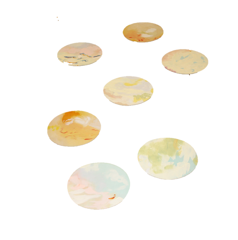
To have a balanced exhibition, we needed a form of symmetry. However, it was a very subtle one, not forced, neither artificial We started with the 2 circular wall pieces: the wooden board landscapes(6) and the textile paintings(8)
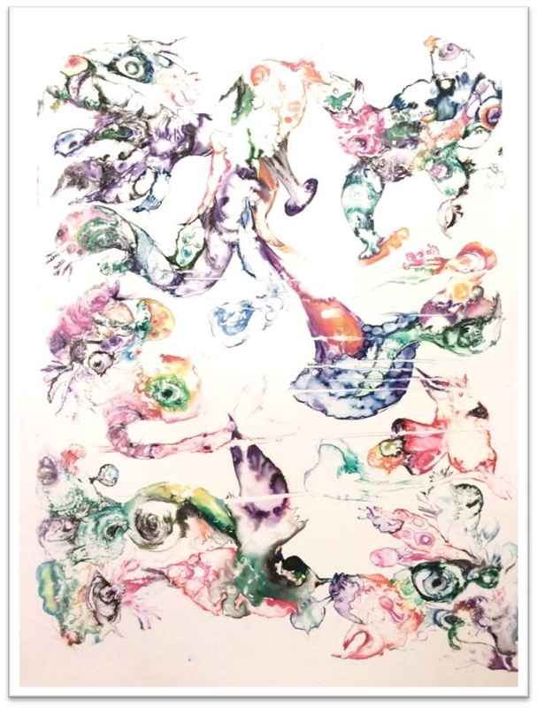
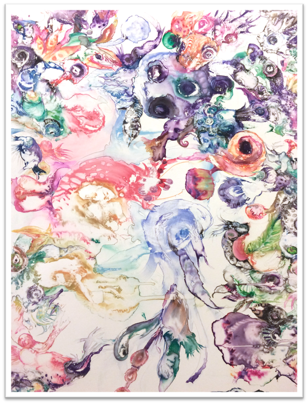
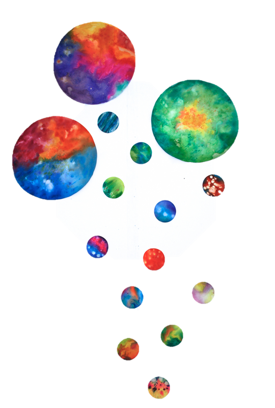
 Next, we had Milly's prints(11). Very vibrant, very dynamic, but, at the same time- the medium would be watercolour
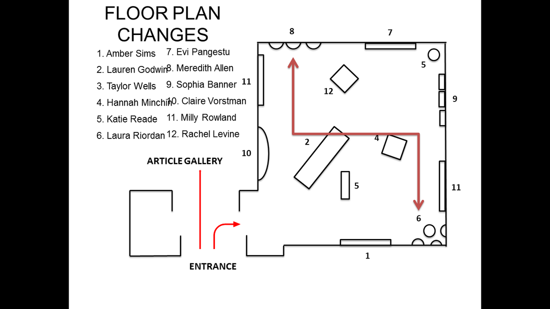
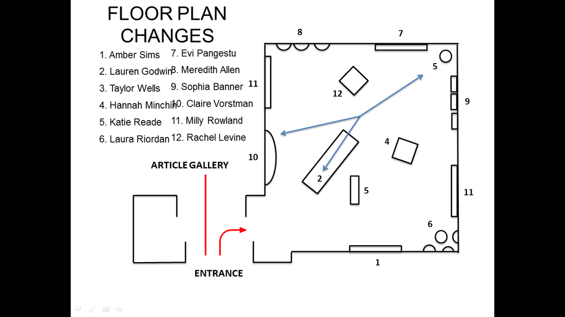
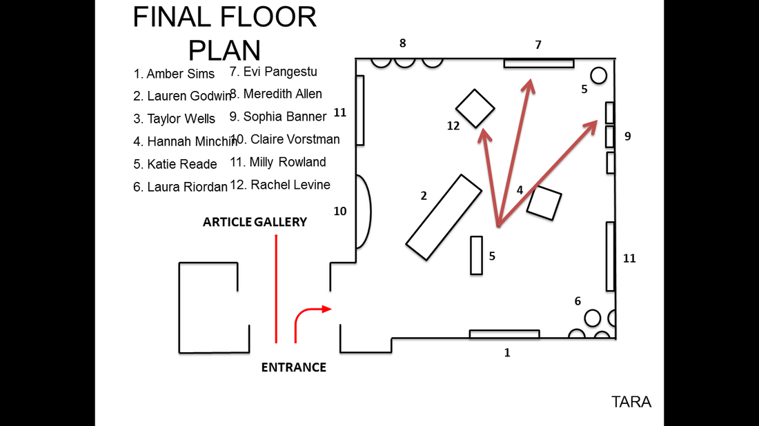
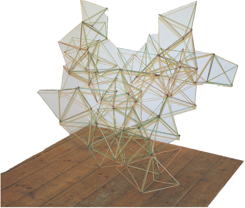
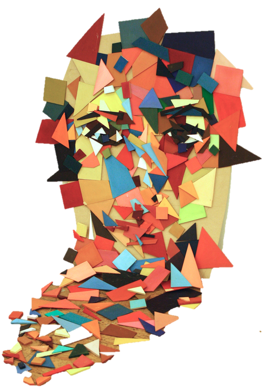
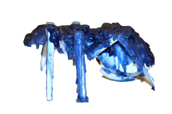
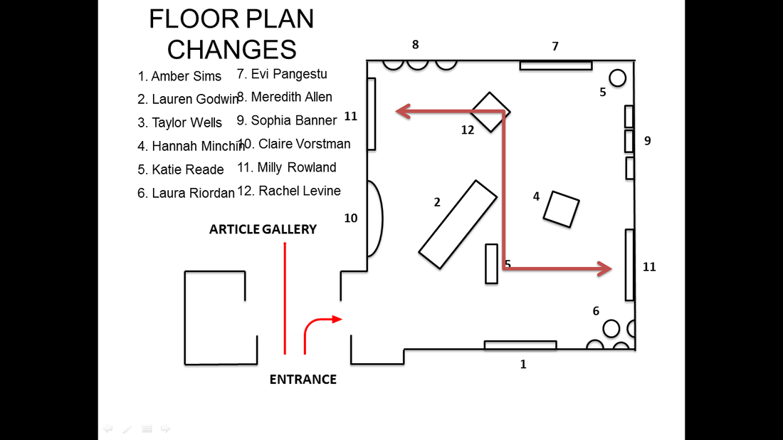 By displaying the 2 circular pieces diagonally mirroring each other we set the tone for the whole exhibition. We now had a vibrant colour's wall and a subtle tone's one. Some of sculptural pieces that we had were quite powerful in terms of coulor. Particularly, the bottle sculpture(5) and the fragmented face(10) As for the stick sculpture(2), it needed to be in the center of the room, as we were not yet quite sure where to have it. Initially, it was displayed in a corner. But it did not work too well. We had the bottle sculpture on a plinth, in the corner. We then had the face next to the screen print. We foud that worked well. Milly's piece was very large, yet, the colours were not loud. Clair's sculpture was colourful, yet it had a sober tone that worked well.
 Next came the colourful pieces that worked perfectly one next to the other. The only thing we had to pay attention to was the distance between the pieces. they needed space to"breath"
 The first row of pictures (10,8,12,7,5,9)show the dynamic coloured pieces, displayed in the blue area. The second one depicts the watercoloury artworks, their area is maked with red in the floorplan.
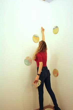
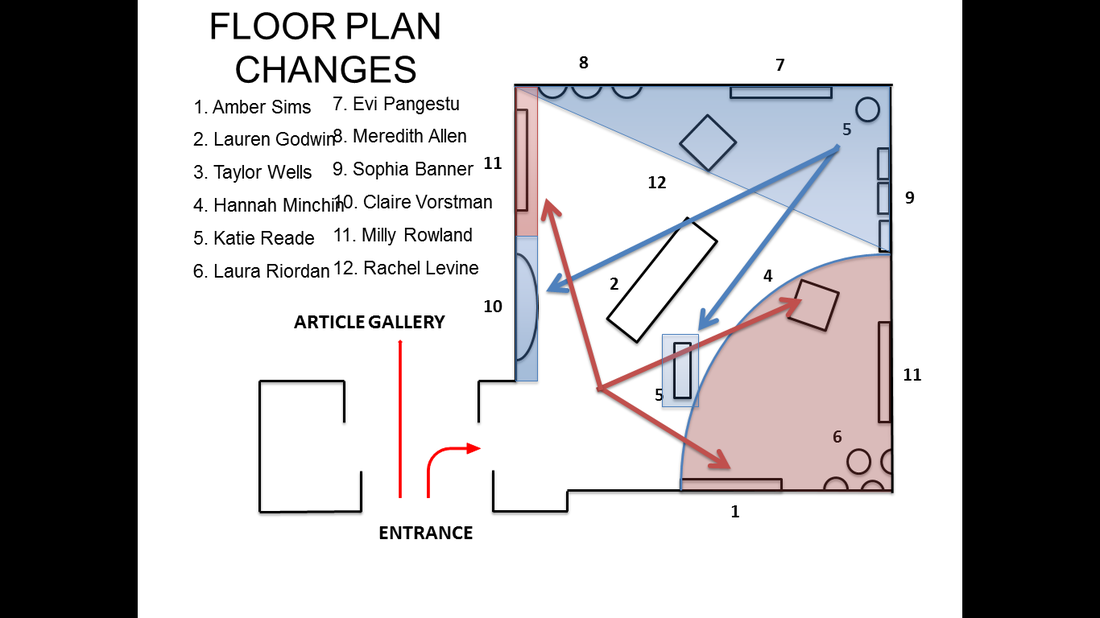 Placed on a plinth, Lauren Godwin's piece(2) managed to hold everything together, harmonizing and balancing the pieces. The fragmentation, the colour and the structure worked as a bridge between the blue and the re area.  2 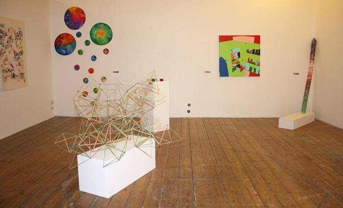 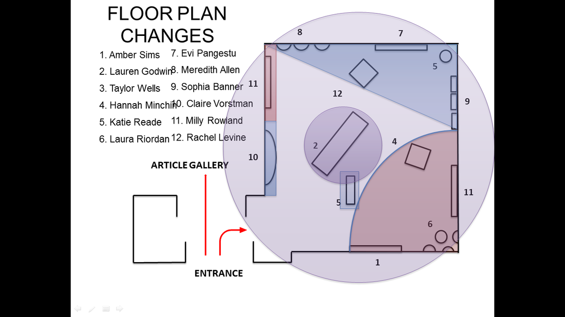 First thing in the morning was collecting the artwork from the artists. Concomitantly, I printed the catalogue.(I encountered some superficial problems, as the document was saved in the latest version of Word and there were only 2 computers that actually opened the document without altering the layout.) Tara, Taiba and I visited all the studios and took the works of art. We then laid them down on the white cube exhibition space so that it would be easy for us to see all the similarities and the contrasts. Collecting all the pieces could have been a very fast task, if all of us worked together towards the same goal. After having everything in the room, we started the hanging. in my opinion, we started late. And again, this task could have been done faster.
 Reading the other groups' PR was very inspirational. All had great ideas. What was wonderful to experience was, in fact, the diversity of ideas and concepts. The work done in Margaret Street is unique, original and so liberal. There may be some common roots for a number of pieces, but the outcomes are surprisingly different. This is one thing I noticed while interviewing artists for the catalogue. So many of them looked up to the same great contemporary artists, yet, their pieces were sharing almost no common detail. The creative process is so complex and the artwork is so intimate that, if I were to find a word describing the School of Art, I would probably choose ECLECTIC. This word properly describes the exhibition module as well.
Taiba was in charge of the PR. As she was always present and very preoccupied by the project, she had a clear idea of the atmosphere and the aim of the exhibition. She wrote about our statement and our relationship with colour, as well as the dialogue that colours challenge us everyday. It felt as a group work. It really did. Taiba and I communicate well. She is very nice and encouraging. We used to show each other what we did and then maybe correct maybe just congratulate what we did. After such an experience(this project overall) I can appreciate differently a hard-working person. A curator (from Latin: curare, meaning "to take care") is a manager or overseer. Traditionally, a curator or keeper of a cultural heritage institution (e.g., gallery, museum, library or archive) is a content specialist charged with an institution's collections and involved with the interpretation of heritage material. A traditional curator's concern necessarily involves tangible objects of some sort—artwork, collectibles, historic items or scientific collections. More recently, new kinds of curators have started to emerge:curators of digital data objects and biocurators.
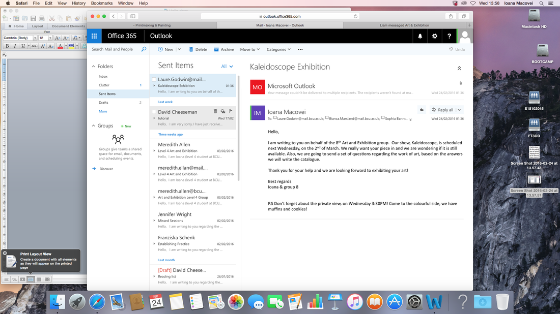
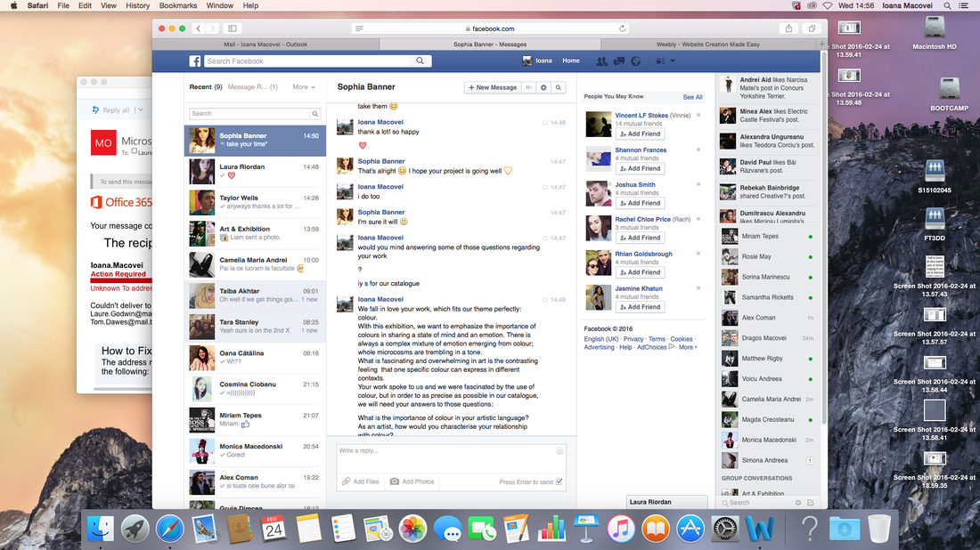
 I was also in charge of contacting every artist and ask if their pieces were still available for our show, which made sense as I had to interview all the artists. After collecting their details, I could finally send the set of questions I thought of. As I was able to see all the pieces, I had a much clearer idea of the show. I was so relieved to discover that our pieces were not disturbing to the eye(as they were meant to be at the begging). They were not loud, crushing each other, they were not just some nice pieces that were selected and then thrown in a room, with no statement to be made, with no message to be sent. Initially, not so much as a group, more as mini-groups, we liked some pieces, some of us felt strong about having all the pieces liked in the final show, no matter if they didn't match. As far as I am concerned, that would have been as insult to the artists, to their pieces. Having a room with a lot of objects, one louder than the other, just so that you could tick some names on a list, would have been a blasphemy! All the pieces would then loose their impact, their value, their emotion. They would just destroy each other. And they would invade the spectator's space, in the most coward way! They would occupy the space. In order for a piece to capture and to overwhelm a viewer, in the most sacred way, it needs to invade his or her mind and soul. It needs to lure him or her closer so that it could then overflow inside a spectator's soul and reveal itself . There is no need whatsoever for it to physically suppress a viewer. It would only be a superficial victory. In essence, the most dastard and narrow one. We needed to make that possible. We needed to give all the pieces the consideration they deserved, their space, their importance, their glow, their heartbeat.  Contacting other students I had to think of the tone and the content of a message, I could probably have just added them on Facebook and ask for their pieces, but it would not have reflected my feelings. it would have been inappropriate. I do respect and admire them and their work. I thought that I could have used a more friendly tone, a more familiar one, but our intentions were to have a professional, successful exhibition. I wrote e-mails, I chatted on facebook, I visited the studios. It was a revelation. The more I knew about the artist, about their practice and about their theme, the more confident I was. Apart from the COLOUR theme they shared(which, let's be honest, it is not sufficient), they all had a feeling of fragmentation, and most IMPORTANT, all the pieces were based on a CONTRAST. The contrast could be visible, or conceptual. They all had a message, they all had a meaning, a meaning that was overall complimentary. It became obvious that all the pieces needed their space in out exhibition, since they were all revealing out loud our aim. They showed the unknown power of colour. they shoed the importance of it. They challenged prejudices and perception. And most important, they were all mirrors. Colours are, I think, the most certain mirror of one's self and feeling, at a certain point. For artists, those colours were reflections of a long creative process and of their artistic struggle at the moment of creation, for the visitor, those colours become reflections of their own feelings. The fragmentation allowed all the viewrs to experiment a large palette of emotions. One colour has millions of interpretation, but an explosion of colours... probably... an INFINITY.
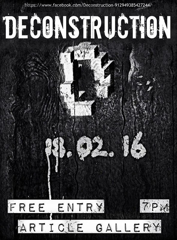
 When it came to making a poster, a problem emerged. We did not have a central piece. We could not choose one that would be representative to the whole exhibition. We wonted an image that reflected our theme, our concept, our title and the works of art. Although we were confident that we woanted some pieces, we colud not arrange all of them in one image(preferably a kaleidoscopic one), because they would not be pleasant to the eye and they could not be readable. The image chosen by Liam as well as the font were indeed an inspired choice, the coulour of the poster-purple- captured the complexity of the colours we want to exhibit, but at the same time, not revealing the whole tension and the whole mister. Indeed if it were to use pictures of the actual pieces, the poster would have looked more as an advertisement for a spectacle. It would have lost it's power.
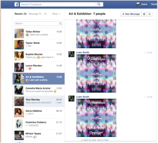 Liam did a nice job with the Poster. It was really a fascinating and quite exciting image. However, i felt it needed a little more polishing here and there. I still think it lacked some important details, like a map of where the exhibition is situated, some artists' names etc. Initially it lacked the hour... But in the end, overall, it was interesting and mysterious.
I wish it was displayed a little bit earlier then the actual exhibition morning . I feel I should have done more for this to be possible( more then just telling Liam to print those posters whenever I could see him), I don't know if that would have been fair. But this way I am quite disappointed I just felt somehow in between two worlds. In one I do my task and stop caring, in the other I do whatever it takes for this exhibition to look the best it could withe the means I have. All this time I struggled to find a balance. It would have been so much easier if more people in our group would have cared more.... I am not saying that with a harsh tone, I am not trying to teach a lesson, I only express my regret. It could have been a completely different experience...there was so much to be enjoyed... |
AuthorWrite something about yourself. No need to be fancy, just an overview. Archives
March 2016
Categories |


 RSS Feed
